By Weïv Mæt-ers
How can waves and their interferences find expression in a website and the experience of it? How can their intensive and elusive nature manifest in site visits and page impressions? Is there a way to design and programme a website that corresponds to the ways in which wavelike phenomena and their disturbances – noise, wireless signals, heat, and light – behave?
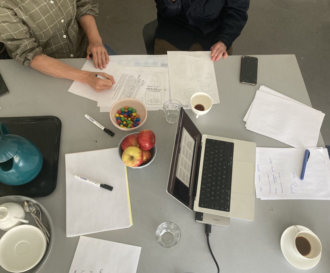
On the 2nd of June, the WAVEMATTERS team travelled from our institute in Berlin Mitte to Katja Gretzinger’s studio in Berlin Wedding to think through these “designerly” questions of creating a project website. The aim and challenge of this website is to translate the wavelike nature of our research subjects into a website design while at the same time affording the means through which to communicate the process that our research project takes (which in itself can sometimes seem wavy). It was our first hands-on meeting with Katja and it was great to see how her propositions resonated with our multi-modal ethnographic ways. We almost immediately entered a discussion on what it means to communicate in a wavy-way – that is, alongside the interferences, the noise, that invariably attaches itself to a communication in a way that is not absolutely clear and distinct but obscure and vague.
Designing the “Buzz”
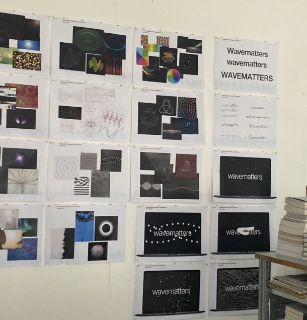
As we entered Katja’s studio, we found ourselves in a workshop full of traces of trying to grapple with the slipperiness of representing waves: images of waves spiralling, looping, oscillating, reflecting, vibrating, typographic experimentations were hanging off the wall, there were old books on acoustics and physics stacked on Katja’s desk, GIFs and animations of waves were in movement on her computer monitor. An experience we were all familiar with. In the next two hours, Katja’s traces of waves, of images, GIFs, around us, served as prompts for our discussions.
To set the scene, Katja played for us a YouTube video: a Ukrainian (his voice dubbed over in German) modifies an old cassette player and passes it overtop various electronics to sonify electromagnetic fields emitted – the buzz of a computer screen, of a computer mouse, and other electronic clutter; the buzz of what Marshall McLuhan, in the 1970s, called the “Electric World”. A world where the idealism of words that correspond to things without betrayal is lost for one of interference and disturbance; a world where we no longer know with clarity and precision, through causal relations; a world where technologies produce invisible infrastructures that need to be rendered visible or audible through special devices and operations.
The buzz in the video is thus at the heart of our design challenge: how do we make a website that reveals this buzz that surrounds us; the buzz that alerts us to it as a disturbance or interference. To refer to McLuhan again, if the medium is the message, what if the message is corrupted: a glitch, an interference?
Messaging – an architectonic for empirical and conceptual findings
Throughout our meeting, our conversation was perhaps split in two like a forked tongue: on the one hand, we fixed what we would like our message to be and how it should be organised through the architectonics of the website; and on the other hand, we sought ways to corrupt it or explored ways to manifest interferences within the interface.
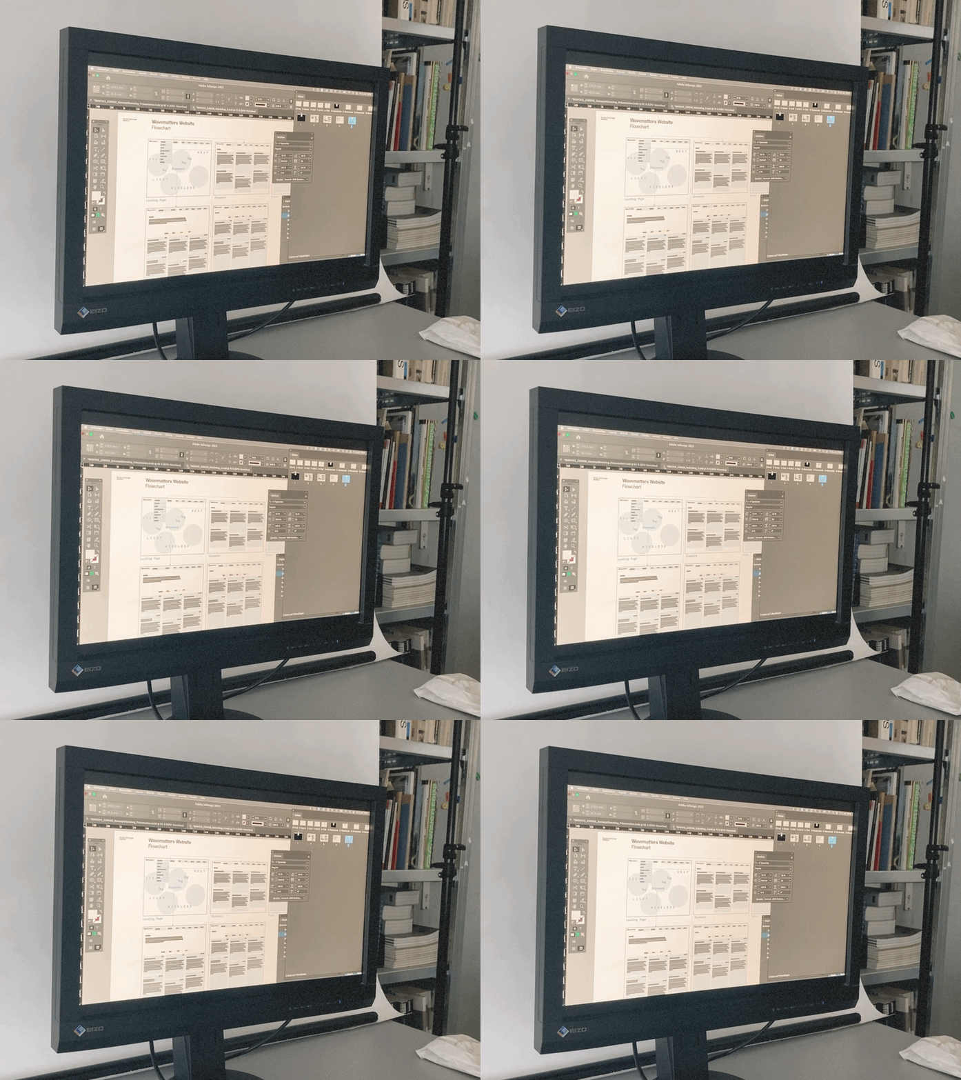
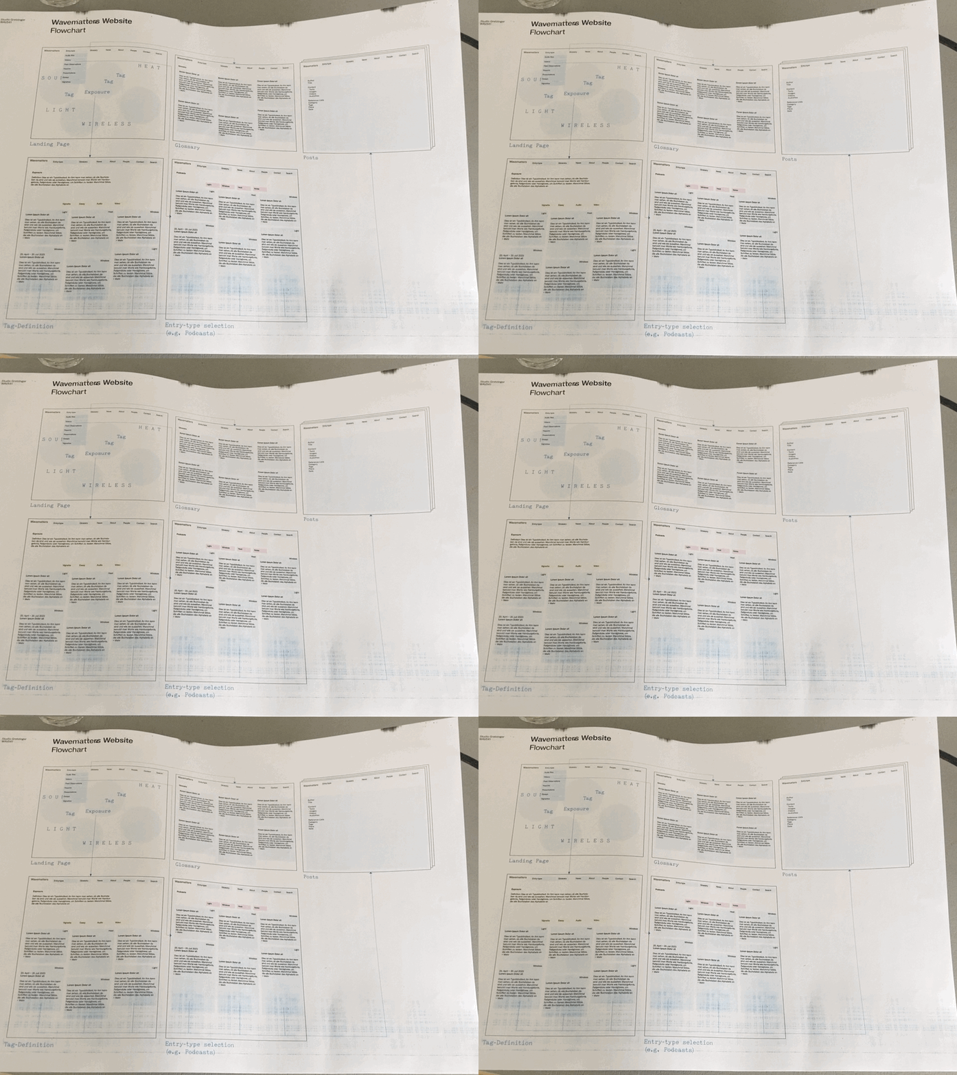
Regarding the messaging, the website will serve as a way to gather, collect, store, and communicate our empirical research findings and our conceptual work. It will be an archive of essays, stories, media (audio-visual, artefactual), and reports that vibrates according to our wavelike interferences: noise, wireless signals, light and heat. That’s the message. This much we knew before our meeting. The design concept is also quite straight forward: our research areas of noise, heat, wireless and light constitute the organisational “categories” for the ethnographic archive; the analytic for cutting up the worlds we encounter.
Alongside the archive, and yet severed from it to avoid corruption and interference, will also be a glossary – an ongoing repository of keywords that we gather in our research, and an invitation for other researchers to join us, to help us develop a conceptual vocabulary for grasping the invisible environment around us. These will all be fixed together within an architectonic that can be navigated via tags. This will also provide us with a sorting system for collecting and organising the traces of our research project as it happens.
Interfering – can tags interact in wavy ways?
Cutting across this architectonic we envision a buzz that deliberately unsettles the stability of the categories and clearcut messages. Our meeting largely turned around this aspect of the website. One way that we grappled through this was via the use of tags.
Tags are common features of websites. Loose organisational elements that entangle different types of content together. Outside of the architectonic of a website, they provide another way to navigate. For instance, you can find everything about “exposure” or “infrastructure” or “law”. They are somewhat like shortcuts: you can find the specific message that you search for. But how do you make them behave in a “wavy” way and what does the mean? We went back and forth, testing different kinds of tag clouds, tags that slowly come in and out, that vibrate or shiver, tags that are fixed and random, tags that move and are diffuse throughout the interface. Somehow, we found ourselves situated at the wave-particle boundary: at a point the tag interacts like a particle, but as it interacts through space, through its environment, it behaves like a wave.
Disturbing website visitors without annoying them
Another aspect of these waves when they manifest in our research is that they cause disturbances – psychological, bodily, and materially. They are also often annoying. You sweat in the heat of the night. It’s late, but wireless signals keep you awake on your smartphone. Noise disrupts your sleep. Artificial light enters your room and permeates your eyelids.
Our plan is to visually manifest such disturbances through particular glitches, flickers, oscillations, and interferences designed or inscribed into the behaviour of the website itself. This is how we imagined it: You are reading an ethnographic vignette and after 90 seconds: A glitch. An image “pops-up” briefly. You are not sure if you actually saw it. And yet it interrupted your reading. It happens again and again. But what are the limits of making a website annoying? How far can you push it? When should the flickering stop?
To be clear, we have no intention to actually annoy our website visitors! So, we thought about incorporating a “turn-off” function. When it comes to environmental noise, electromagnetic waves, artificial light and heat, you can relax in tranquil or dark spaces, green zones, or white zones. You can turn down the volume of the noise, unplug your Wi-Fi router or enter Airplane Mode on your mobile devices, close the curtains, shelter within the shade of trees.
Yet, how should “stopping the buzz” be translated into a user experience on our website? Could the “green of Nature” – with a capital “N” – be a way to represent the calm and tranquillity? There was no final decision that day. We like the idea of mobilising Nature, but don’t want to be too placative. Our ideal is a function in our website that can satisfy our desire to briefly exit the disturbances of our contemporary world.
Conveying ethnographic situated knowledges
The final aspect that we explored was how to bring the “texture” of our field sites into the website beyond the textual. This is closely related to our goal to generate and make visible situated knowledges through our ethnographic approaches. Our research is not only about these waves, but how they materialise in different ways within the specific urban contexts of different cities around the globe: We listen with our research partners to the environmental noise of Paris and Barcelona. We are sweating and suffering with other living organisms in the heat of Las Vegas, Podgorica or Madrid. We trace with concerned citizens and experts the electromagnetic radiation of wireless signals or light. We’re very much interested in how physical waves are also urban – a matter of infrastructure, politics and ways of cohabiting in cities beyond their specifications in physics or in biology or in other kinds of natural sciences. There is something about the build-up of cities that creates issues: heat island effects, exposure patterns of wireless signals, light trespass, the transversality of noise that cuts across other urban issues like a surface effect.
The way in which the urban fabric reflects, absorbs and emits these waves turns them into urban phenomena. Yet, how do we explore this in our website? Is there a way to incorporate the sounds of urban contexts into the functionality and user experience? Or that elusive feeling of being exposed to electromagnetic signals or, perhaps, the experience of being over connected? Can the almost suffocating feeling of sweating be transposed onto the almost dis-embodied experience of a website?
We have not yet figured everything out. We meet with Katja soon to see how far this line of flight takes us. In the meantime, we look forward to our project website with great excitement.
